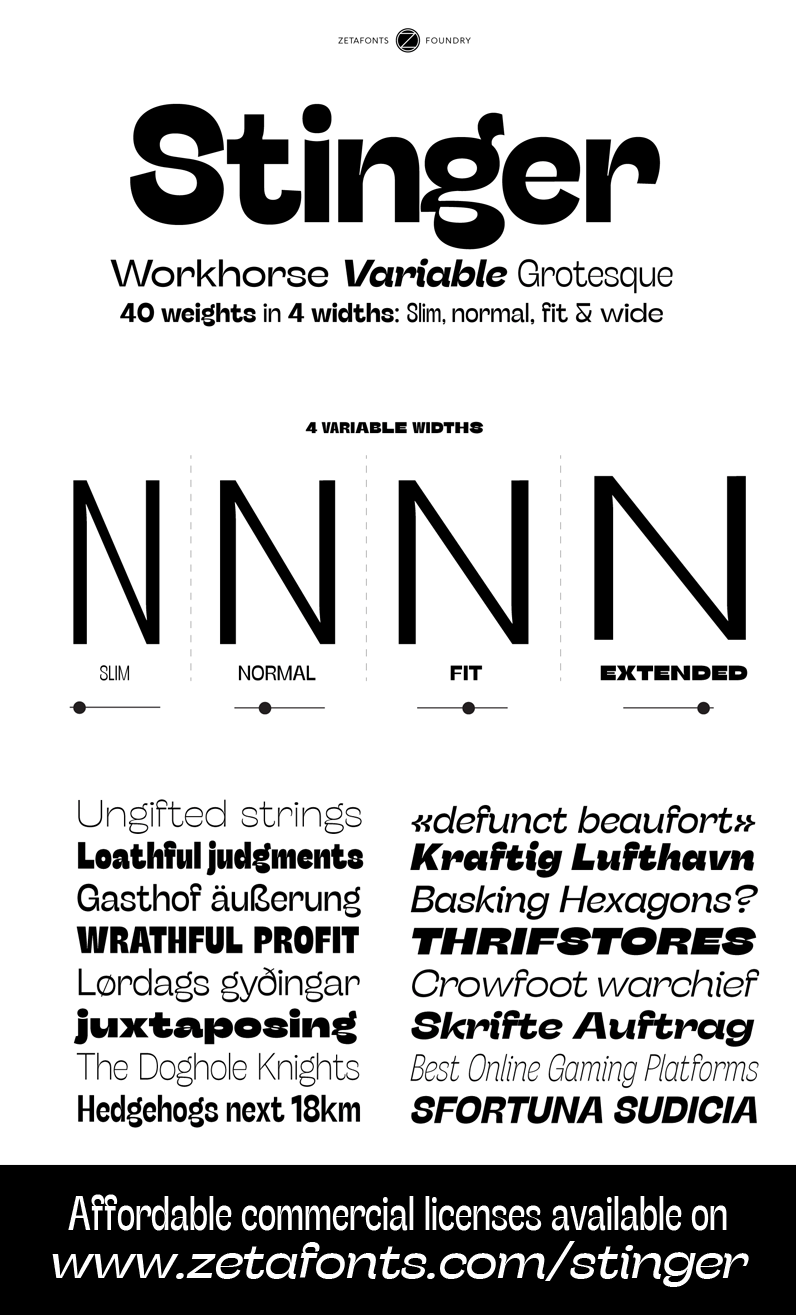
Stinger
The quick brown fox jumps over the lazy dog
- StingerWideTrial-Bold
StingerWideTrial-Bold
Download Font TTF - StingerTrial-BoldItalic
StingerTrial-BoldItalic
Download Font TTF - StingerTrial-Heavy
StingerTrial-Heavy
Download Font TTF - StingerTrial-HeavyItalic
StingerTrial-HeavyItalic
Download Font TTF - StingerTrial-Italic
StingerTrial-Italic
Download Font TTF - StingerTrial-Light
StingerTrial-Light
Download Font TTF - StingerTrial-LightItalic
StingerTrial-LightItalic
Download Font TTF - StingerTrial-Regular
StingerTrial-Regular
Download Font TTF - StingerTrial-Thin
StingerTrial-Thin
Download Font TTF - StingerTrial-ThinItalic
StingerTrial-ThinItalic
Download Font TTF - StingerTrial-Bold
StingerTrial-Bold
Download Font TTF - StingerWideTrial-BoldItalic
StingerWideTrial-BoldItalic
Download Font TTF - StingerWideTrial-Heavy
StingerWideTrial-Heavy
Download Font TTF - StingerWideTrial-HeavyItalic
StingerWideTrial-HeavyItalic
Download Font TTF - StingerWideTrial-Italic
StingerWideTrial-Italic
Download Font TTF - StingerWideTrial-Light
StingerWideTrial-Light
Download Font TTF - StingerWideTrial-LightItalic
StingerWideTrial-LightItalic
Download Font TTF - StingerWideTrial-Regular
StingerWideTrial-Regular
Download Font TTF - StingerWideTrial-Thin
StingerWideTrial-Thin
Download Font TTF - StingerWideTrial-ThinItalic
StingerWideTrial-ThinItalic
Download Font TTF - StingerSlimTrial-Bold
StingerSlimTrial-Bold
Download Font TTF - StingerFitTrial-BoldItalic
StingerFitTrial-BoldItalic
Download Font TTF - StingerFitTrial-Heavy
StingerFitTrial-Heavy
Download Font TTF - StingerFitTrial-HeavyItalic
StingerFitTrial-HeavyItalic
Download Font TTF - StingerFitTrial-Italic
StingerFitTrial-Italic
Download Font TTF - StingerFitTrial-Light
StingerFitTrial-Light
Download Font TTF - StingerFitTrial-LightItalic
StingerFitTrial-LightItalic
Download Font TTF - StingerFitTrial-Regular
StingerFitTrial-Regular
Download Font TTF - StingerFitTrial-Thin
StingerFitTrial-Thin
Download Font TTF - StingerFitTrial-ThinItalic
StingerFitTrial-ThinItalic
Download Font TTF - StingerFitTrial-Bold
StingerFitTrial-Bold
Download Font TTF - StingerSlimTrial-BoldItalic
StingerSlimTrial-BoldItalic
Download Font TTF - StingerSlimTrial-Heavy
StingerSlimTrial-Heavy
Download Font TTF - StingerSlimTrial-HeavyItalic
StingerSlimTrial-HeavyItalic
Download Font TTF - StingerSlimTrial-Italic
StingerSlimTrial-Italic
Download Font TTF - StingerSlimTrial-Light
StingerSlimTrial-Light
Download Font TTF - StingerSlimTrial-LightItalic
StingerSlimTrial-LightItalic
Download Font TTF - StingerSlimTrial-Regular
StingerSlimTrial-Regular
Download Font TTF - StingerSlimTrial-Thin
StingerSlimTrial-Thin
Download Font TTF - StingerSlimTrial-ThinItalic
StingerSlimTrial-ThinItalic
Download Font TTF


 Your download will begin in 5 seconds.


