- Free for Personal Use
- Muddy
- Tough
- Dirty
- Stressed
- Poster
- Off-Road
- Tire Tracks
- Tire Treads
- Automobilia
- Automotive
- Fringy
- Rugged
- Patterned
- Fat
- Fancy
- Eroded
Rugged Ride Font
- Rugged Ride
Rugged Ride
Download Font TTF
- Rugged Ride
- ! !
- " "
- # #
- $ $
- % %
- & &
- ' '
- ( (
- ) )
- * *
- + +
- , ,
- - -
- . .
- / /
- 0 0
- 1 1
- 2 2
- 3 3
- 4 4
- 5 5
- 6 6
- 7 7
- 8 8
- 9 9
- : :
- ; ;
- < <
- = =
- > >
- ? ?
- @ @
- A A
- B B
- C C
- D D
- E E
- F F
- G G
- H H
- I I
- J J
- K K
- L L
- M M
- N N
- O O
- P P
- Q Q
- R R
- S S
- T T
- U U
- V V
- W W
- X X
- Y Y
- Z Z
- [ [
- \ \
- ] ]
- ^ ^
- _ _
- ` `
- a a
- b b
- c c
- d d
- e e
- f f
- g g
- h h
- i i
- j j
- k k
- l l
- m m
- n n
- o o
- p p
- q q
- r r
- s s
- t t
- u u
- v v
- w w
- x x
- y y
- z z
- { {
- | |
- } }
- ~ ~
-
- ¢ ¢
- £ £
- ¤ ¤
- ¥ ¥
- ¦ ¦
- § §
- © ©
- ® ®
- ¼ ¼
- ½ ½
- ¾ ¾
- É É
- Ö Ö
- × ×

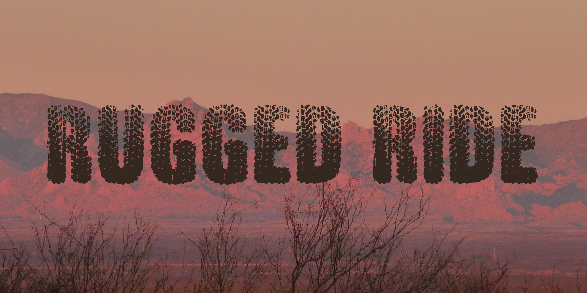
RUGGED RIDE is a muddy, weekend-in-the-high-country sort of font, a tough and dirty stressed poster design mangled through the filter of off-road tire treads. Unlike most of my stressed poster designs, this one required a bit of preliminary research ... Tire treads are pretty serious stuff to those who make (and use) tires professionally, and many *tread*marks are also *trade*marks (and valued patents) of their inventors and manufacturers ... so rather than trod on another's tread, I had to trot out my very own. To give it an authentic feel (I doubt it would pass engineering muster) I researched mud-tires, all-terrain tires, and tractor tires, because I knew I'd be going for a wet, mud-track look (I also glanced at rock-riding tires and others, but more in an ambling haze of wonderment than as research, because before I began this project I was blissfully unaware of how many types exist).
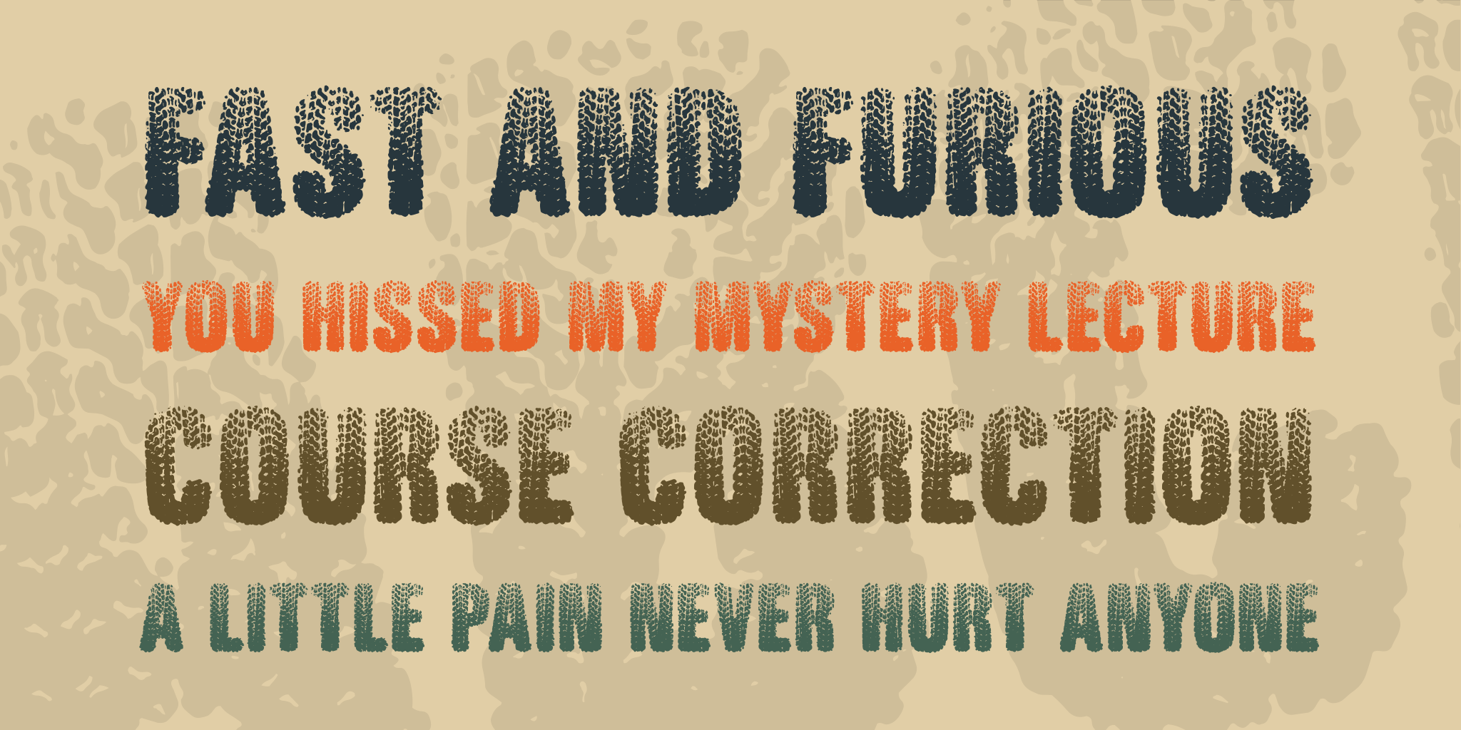
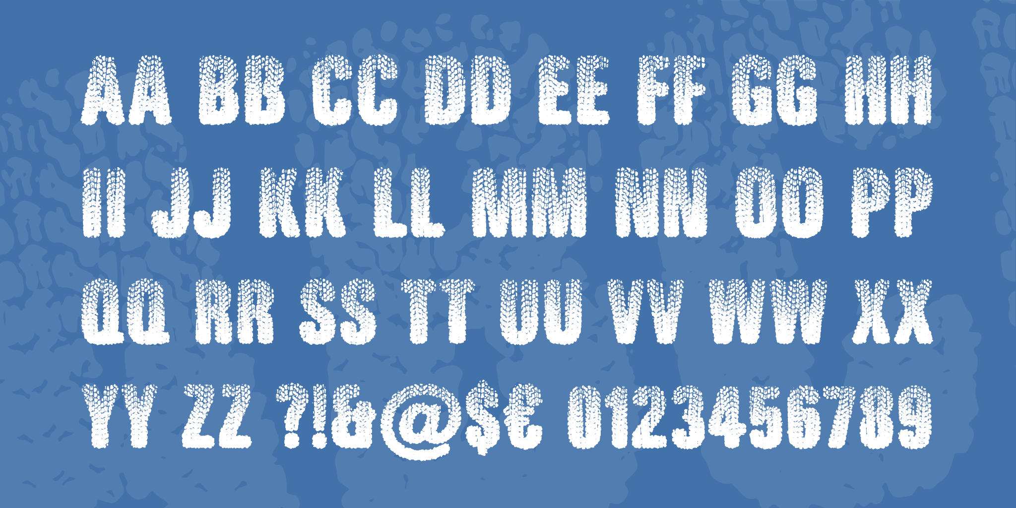
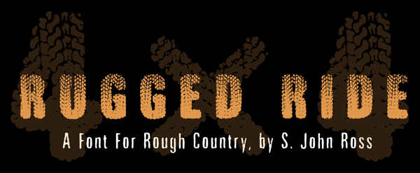
RUGGED RIDE is a full-U.S.-keyboard all-caps font, with two distinct sets of caps (one mapped to the lowercase glyphs) to avoid the niggling annoyance of two identical stressed letters next to each other. The font's title shows this off pretty well, since it repeats R, G, E and D! RUGgED rIde, indeed. The font sports a few off-the-beaten-trail extras, including a clean (unstressed, unsoftened) version of the font's own tread design, mapped as the generic currency glyph (if you're working in an application that supports OpenType ligatures, you can also summon it with three backslashes in a row). Unlike most of my fonts, RUGGED RIDE includes a multiplication sign (×), because a trail-riding tire font (tyre font in some countries!) that can't spell 4×4 is just broken. Use this one BIG ... regard 72 points as the bare minimum, not the end of the pull-down list ...
If you're interested in licensing this font for public or organizational use, email me at (Javascript must be enabled to view this email address) and be sure to specify the font's title. I'll respond with instructions.


 Your download will begin in 5 seconds.
Fonts like Rugged Ride
- Popular Fonts
- Death Note Font
- Minecraft Font
- League of Legends Font
- Pokemon Font
- Jujutsu Kaisen
- Bluey Font
- Barbie Font
- Fortnite Font
- Popular Tags
- Calligraphy Fonts
- Cursive Fonts
- Script Fonts
- Fancy Fonts
- Tattoo Fonts
- Handwriting Fonts
- Cute Fonts
- Modern Fonts
- Vintage Fonts
- Retro Fonts
- Fun Fonts
- Christmas Fonts
- Wedding Fonts
- Western Fonts
- League of Legends Fonts
- Anime Fonts
- Old English Font
- Connections Hint Today
- Connections Answers Today
- Disney Fonts


