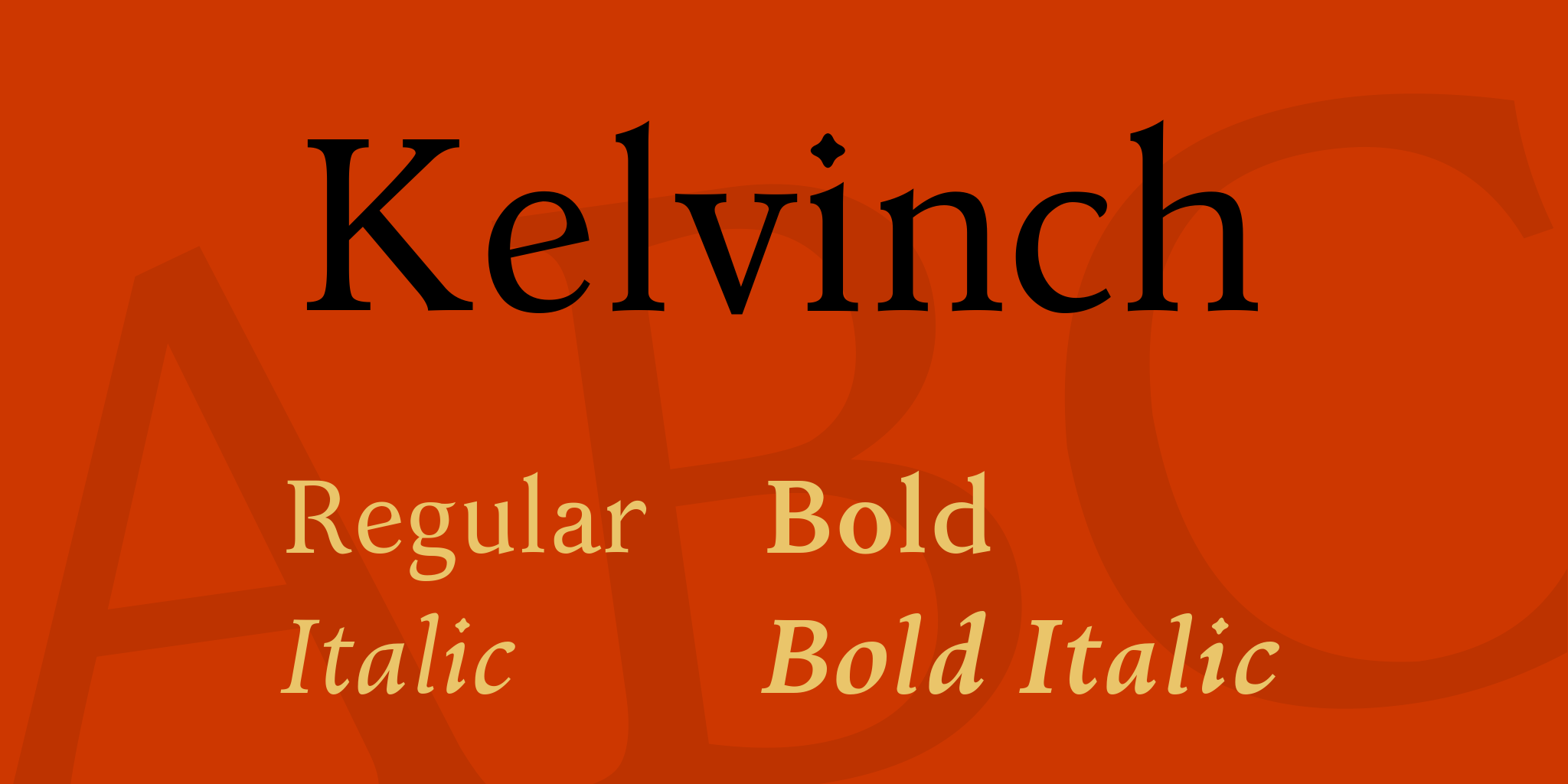
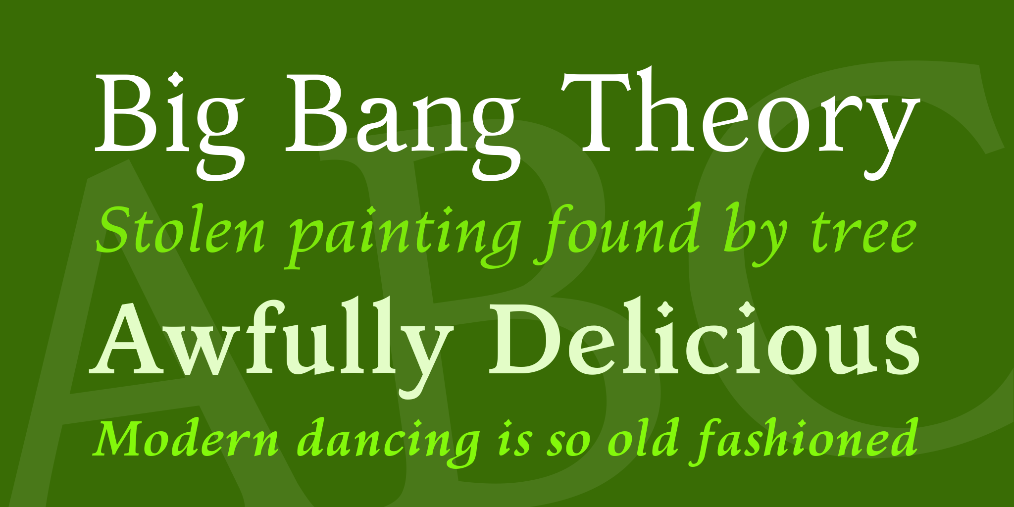
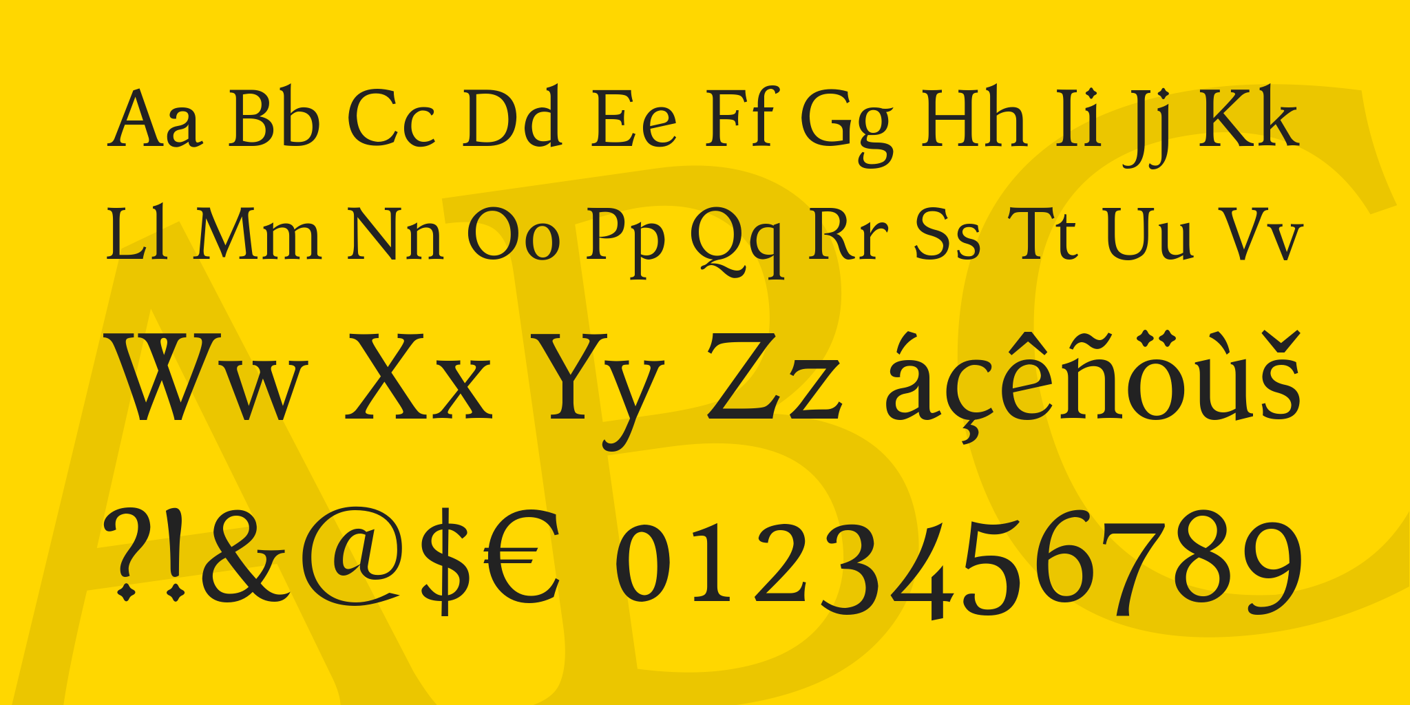
Although Kelvinch is meant for body text I have endeavoured to make the characters as aesthetically pleasing as possible without compromising its objective to be comfortable to read in long texts.
It comes in Regular, Italic, Bold and Bold Italic faces.
Kelvinch is a free font, free in the sense of free of restrictions and DRM but also free in the sense of cost.
Under the terms of the license you may use Kelvinch in any kind of publication, print or electronic, without fees or restrictions. You may modify the font for your own use. You may distribute your modified version in accordance with the terms of the SIL license.
You may use Kelvinch for any purpose including commercial usage. The only thing you may NOT do is sell the font on its own as a stand alone font.
Kelvinch is licensed under the SIL Open Font License: for the full text, go to scripts.sil.org/OFL.
It started out as my own personal font but somewhere along the way that changed and other people became interested in it and I took the decision to try to make it good enough that I wouldn't be embarrassed to know that other people were using it. I never once considered selling it.
It covers many Unicode blocks including Greek & Coptic, Cyrillic, Georgian, Armenian, Mathematical Operators, Miscellaneous Symbols, Dingbats, Runes, Letterlike Symbols, Arrows and a comprehensive coverage of most of the Latin blocks.
It has taken over a year to develop.
Enjoy.
Update, 14th April 2016
Updated to version 3.1 - There was a fault in the kern tables in 3.0, some of the kern pairs for the Roman font didn't work. Also changed the position of many diacritic marks to improve the overall appearance of the font. Also changed the format of the download file from .7Z to .ZIP , although this is bigger it is also more compatible with computers which do not have 7zip installed.
Everything else is the same!
Update, 8th May 2016
And I thought this was finished, how wrong I was.
Based on the feedback I received I corrected some mistakes and changed a few things including the crossbar on the Upper Case 'A' which most people thought was a mistake. It's a pity, Kelvinch has lost some of it's character, but then character is not what you want in body text, it can become tiresome very quickly, oh well ...
Added some more Open Type features and re-kerned the whole thing.
Also changed the website address to the address of my blog, the free webhosting I tried wasn't very good and just seemed like they were trying to force people into getting their paid webhosting by offering very bad service to the free customers and making things very difficult for them. So kelvinch.uk never got up and running, sorry.
Hopefully this WILL be the last version.
11th May 2016
Minor update. I re-introduced the curved crossbar on the capital A as an open type stylistic alternative. The default is the straight crossbar.
Did the Historic Ligatures which I had always intended to do but in the midst of everything else it was forgotten until now. The characters were already there it was only the open type feature which needed adding.
Everything else is the same.
Hopefully THIS will be the final version.
Update 23 September 2016 - Version 3.3
Optimised all the glyphs, resulting in smaller files. Evened out and tweaked some of the kerning. Changed the ligatures to work better with Microsoft Word and added two characters new to the Unicode 9.0 standard.
Everything else is the same.
Update 10 January 2017 - Version 3.31
Sorted out three problems. Minor fixes. This is the final version!
Update 22 July 2017 - Version 3.4
Someone pointed out a serious bug in the font. This has now been corrected. Also the source files have been included in the .ZIP file. If you don't want to modify the font or use parts of the font for your own creation then just ignore the contents of the 'Source Code' folder. For normal use you only need the .OTF files.


 Your download will begin in 5 seconds.


