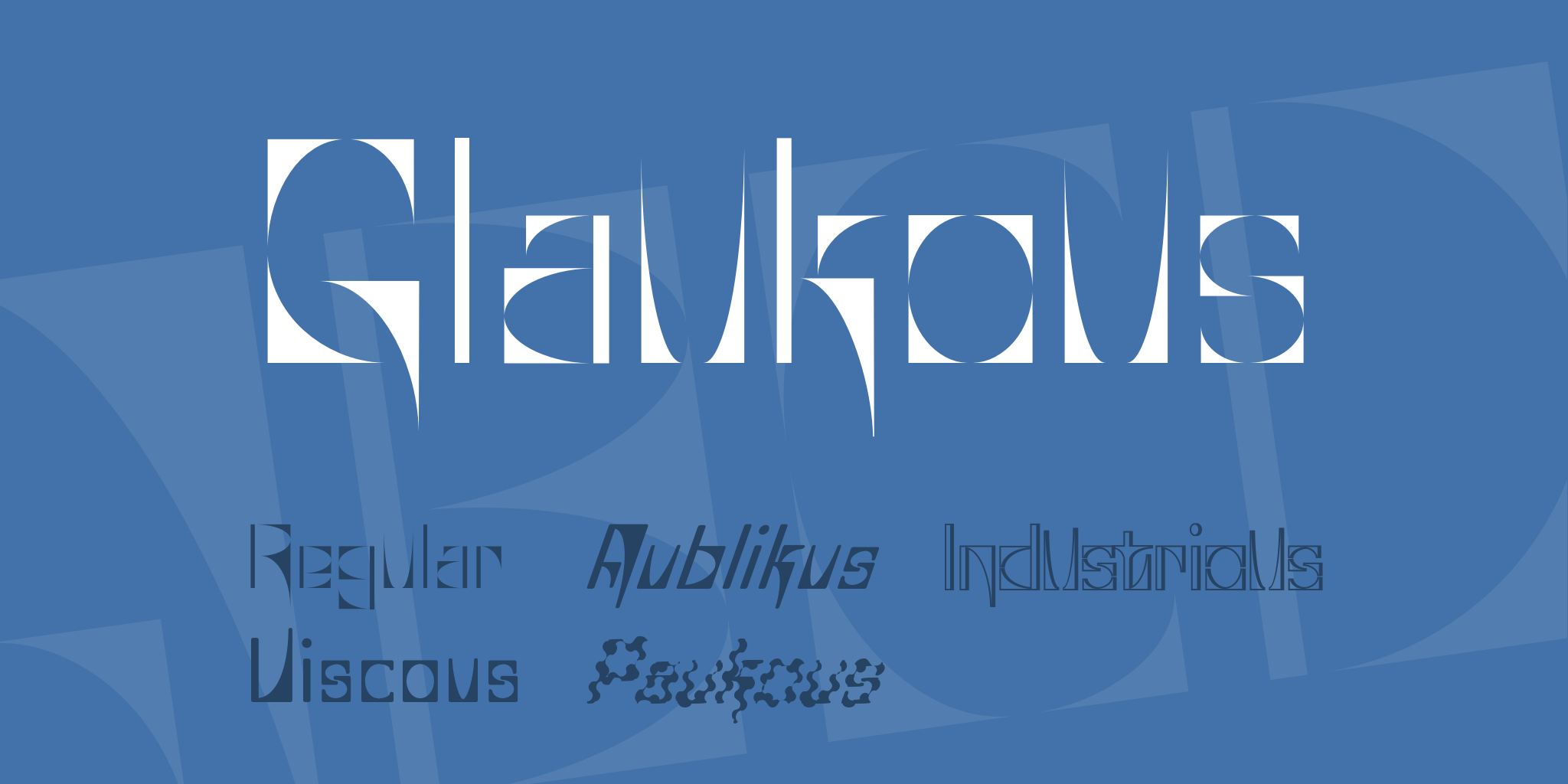
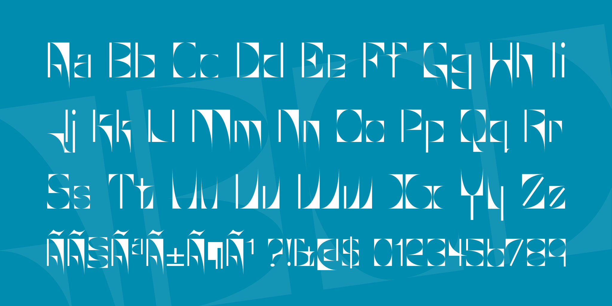
Glaukous began from one letter on a sign above a rave clothing store in downtown Toronto. The name of the store is ZUPJAR. The sign had nothing on it but the name, with each letter being completely different in style from the rest. The letter that became Glaukous was the J.
Rich ventured once again into the land of geometry to make this one, except this time it wasn't as straight forward a concept as Textan. He had very limiting denominators to deal with. And I must say he did a hell of a job with what he had. Pushing rasterizers to their full limits is not something you see people attempt often.
About 98% of the original Glaukous letters were mostly done by Rich. I remember adding a few myself, but can't remember which ones. I did the kerning (easy task there, given the geometrical nature of the font). Then I suprised Rich by adding the 4 other fonts to the pack. The idea behind Viscous and Aublikus was basically to humanize the geometry of the original font. Those two took some time cleaning up and rekerning. Industrious is a straight shadow effect, tweaked for the hints. Paukous is the result of stacking two Photoshop filters on Aublikus. Bless be the discontinued plugins of Rubberman.
Aublikus turned out to be my favourite font of the set. Maybe I'm still having techno flashbacks here, but that thing MOVES.
Hope you like it. Be happy.
© Richard Parker & Apostrophic Labs. All rights reserved. (Javascript must be enabled to view this email address)


 Your download will begin in 5 seconds.


