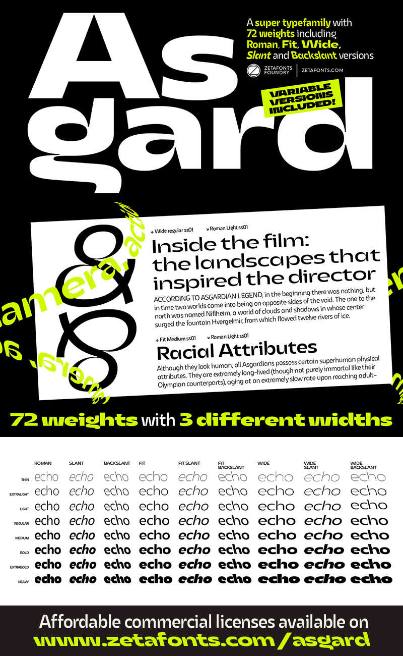
Asgard Wide
The quick brown fox jumps over the lazy dog
- AsgardTrial-WideRegular
AsgardTrial-WideRegular
Download Font TTF - AsgardTrial-WideXlightItalic
AsgardTrial-WideXlightItalic
Download Font TTF - AsgardTrial-WideXlightBackslant
AsgardTrial-WideXlightBackslant
Download Font TTF - AsgardTrial-WideXlight
AsgardTrial-WideXlight
Download Font TTF - AsgardTrial-WideXboldItalic
AsgardTrial-WideXboldItalic
Download Font TTF - AsgardTrial-WideXboldBackslant
AsgardTrial-WideXboldBackslant
Download Font TTF - AsgardTrial-WideXbold
AsgardTrial-WideXbold
Download Font TTF - AsgardTrial-WideThinItalic
AsgardTrial-WideThinItalic
Download Font TTF - AsgardTrial-WideThinBackslant
AsgardTrial-WideThinBackslant
Download Font TTF - AsgardTrial-WideThin
AsgardTrial-WideThin
Download Font TTF - AsgardTrial-WideRegularItalic
AsgardTrial-WideRegularItalic
Download Font TTF - AsgardTrial-WideRegularBackslant
AsgardTrial-WideRegularBackslant
Download Font TTF - AsgardTrial-WideBold
AsgardTrial-WideBold
Download Font TTF - AsgardTrial-WideMediumItalic
AsgardTrial-WideMediumItalic
Download Font TTF - AsgardTrial-WideMediumBackslant
AsgardTrial-WideMediumBackslant
Download Font TTF - AsgardTrial-WideMedium
AsgardTrial-WideMedium
Download Font TTF - AsgardTrial-WideLightItalic
AsgardTrial-WideLightItalic
Download Font TTF - AsgardTrial-WideLightBackslant
AsgardTrial-WideLightBackslant
Download Font TTF - AsgardTrial-WideLight
AsgardTrial-WideLight
Download Font TTF - AsgardTrial-WideFatItalic
AsgardTrial-WideFatItalic
Download Font TTF - AsgardTrial-WideFatBackslant
AsgardTrial-WideFatBackslant
Download Font TTF - AsgardTrial-WideFat
AsgardTrial-WideFat
Download Font TTF - AsgardTrial-WideBoldItalic
AsgardTrial-WideBoldItalic
Download Font TTF - AsgardTrial-WideBoldBackslant
AsgardTrial-WideBoldBackslant
Download Font TTF


 Your download will begin in 5 seconds.


